


Out with the old...
Fermob is the only name in the furniture industry to offer a wide range of colours as standard. Please note, the colours on the page only show those discontinued from 2017 onwards.
Every year to keep up with on going trends, Fermob will refresh its colour palette by discontinuing certain colours. This doesn't mean they've fallen out of love with them, just that Fermob always want to stay one step ahead of the curve!
If you have furniture in these colours and are looking to match, we may still have stocks of furniture in the discontinued colours. The most recently retired colours may still be in production with a lead time of around 6 months. Alternatively, we can help you create a new colour scheme with Fermob's current colour palette.
If you’re looking for paint to touch up your furniture in the discontinued colour, please do get in touch because there is a chance we may have spray paint or touch up pens still available.
Call us on 0345 605 2505, or alternatively send us an email to customerservices@worm.co.uk and we can do our best to help!


We said goodbye to Carrot in 2019. As the name would suggest, Carrot was a gorgeous bright orange! The smooth finish reflect light beautifully - perfect for brightening up any garden!

We waved a fond farewell to Verbena in 2020. A vibrant, acid toned green with a smooth finish, this bright green will certainly be missed!


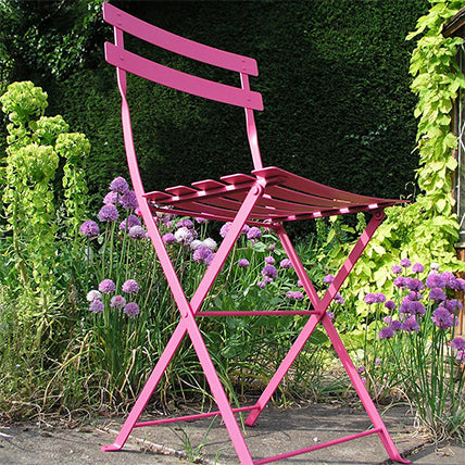
We said goodbye to this vibrant pink in 2017. A fun, bright colour that worked perfectly with Lagoon Blue and Cotton White.

This rich blue shade was discontinued in 2018. Turquoise truly was the colour of the ocean! An intense shade of blue that shines in the sun, and really evokes the feeling of the sea side. For an alternative, we would suggest taking a look at Lagoon Blue.


We bid a fond farewell to Aubergine in 2019. Chic and bright, Aubergine was a warming colour that worked well with neutrals, or even a contrasting bright colour. A matt textured finish, Aubergine worked in standalone pieces or within a strong palette.


Lagoon Blue was discontinued in 2021. With its smooth glossy finish, Lagoon sat perfectly between green and blue. For an alternative blue tone, try Opaline Green or Acapulco Blue.


Paprika was sadly discontinued in 2017. This spicy shade of orange was subtle, working great with neutral colours such as Steel Grey and Liquorice. If you're looking for a brighter orange, try Carrot.


We said goodbye to this soft shade in 2018. Linen could marry brights and neutral colours to create classic, timeless results. With slight golden sparkle, this shade really glowed in the sun. As an alternative, take a look at either Cotton White or Nutmeg.


Plum was sadly discontinued in 2019. A very popular, muted purple tone that really worked well with neutral shades or as a way to tone down brighter colours.

We waved farewell to Steel Grey in 2021. Steel Grey was a good base shade for graphic palettes. It has a metallic finish, which might not suit all tastes, but really shines in the sun. For an alternative, take a look at Clay Grey.


We sadly said goodbye to the vibrant Pink Praline in 2023. This colour added that special pop of colour to any outdoor space, and certainly enhanced any tropical vibe if added to green tones such as Cactus.


The wonderfully earthy Russet was also discontinued alongside Pink Praline in 2023. While not everyone's favourite, Russet certainly provided a complementary tone to the more muted greens such as Willow Green and Rosemary.