


Fermob Trends 2021 - Light on Pastel
What colours and collections are trending for March and April?

The recent introduction of 3 new pastel shades to the Fermob colour palette has delivered a delightful and refreshing uplift to the colour chart.
Combined with the traditional tones of Nutmeg and Cotton White, these pastels will add tranquility to your outdoor space.
The soft, yet bright shades will add freshness and we thoroughly encourage mixing and matching these tones.
If you’re feeling brave, you can add touch of flair by using the contrasting colours of Capucine or Opaline Green.
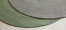
You can use pastel accessories to add softness to your existing furniture by using outdoor scatter cushions or decorative trivets.
Colours in this trend...


Accent with…


Pieces we love...


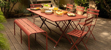
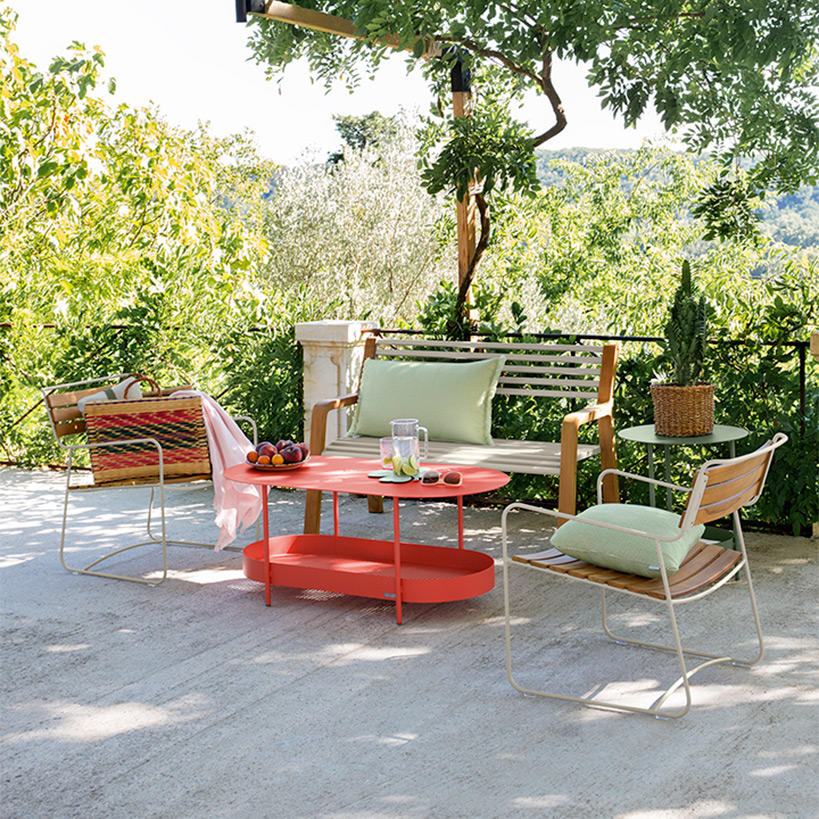
The pastel shades work really well for lounge furniture. There are plenty of pastel accessories available, from Trefle Cushions to handy Cocotte Side Tables. The addition of a bright Opaline table adds a pop of fun.
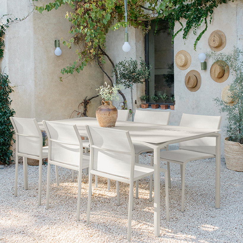
As for dining, for a soft and subtle approach, keep it simple by using one colour with the Cadiz Dining Collection in Clay Grey.
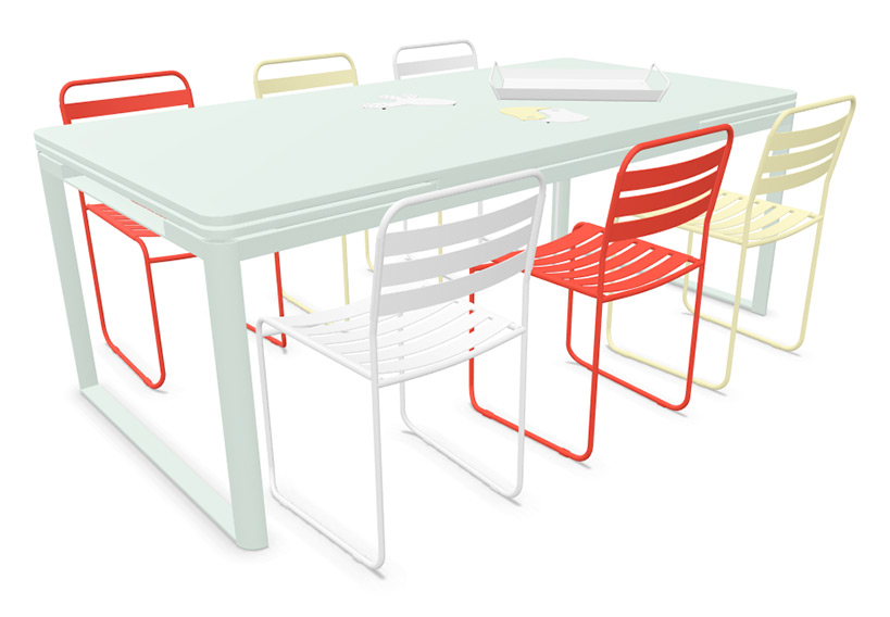 If you're feeling brave, we love the combination of soft pastels with a bright, contrasting colour. This modern styling works well with modern furniture, such as the Surprising Chairs and Biarritz Extending Table. You can add an Alto Tray and Trivets in Cotton White to tie the look together.
What do you think of this perfectly pastel trend? Would you stick with one pastel, or combine lots of colours? Let us know in the comments!
Take a look at all upcoming Fermob Trends here >>>
- choosing a selection results in a full page refresh
Comments
Follow Us
Previous Posts
Creating fat cakes for garden birds - Angela's recipe
Around the Fire: Trust, Betrayal and a Flame That Won’t Go Out
Fermob Trends 2025 - Clay Shade
12 Luxurious Garden Gift Themes
Garden Gifts to make their Christmas Special
Repotting Large Outdoor Plants: What You Need to Know
Fermob Trends 2025 - Ocean Wave
The Oxfordshire Gardener - February 2025
Nottingham Street Artist Soz Mate Brings Colour to Derby Street