The 10 most popular colours for your outdoor space
And the most popular colours are...

Choosing the right colours can make or break the ambiance of your outdoor space. Whether you prefer calming neutrals or bold shades, the right colours can elevate your mood and create a refreshing sanctuary.
In our recent Fermob Week competition, The Worm that Turned surveyed over 20,000 customers and asked them to name their top three favourite garden colours. They responded with an amazing 95 unique colour combinations, full of delightful details and specific favourite shades. For simplicity, we narrowed this down to a broad range of hues to try and determine any trends and frequently occurring colours.
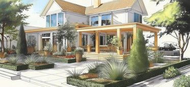
We found the most popular combination was a soothing mix of green, blue and white, evocative of a freshly mown lawn on a Summer day, or a stream tumbling lazily through a thicket of woods. We've had our creative team illustrate this in a 'moodboard' that we hope you can take some ideas from.
If you’re in the middle of a garden revamp and need some colour inspiration, or are idly colour curious, read on to discover the most popular colour picks for 2023 and our ideas for how you can inject them into your outdoor space.
1. Green - 57%

Green took the top spot as the most popular colour for outdoor spaces. Green is inseparable from gardening, and its appearance is a sure sign of health and vigour. If you enjoy having nature in your outdoor space, then green will undoubtedly need to be considered as a key part of your palette.
Of the many types and shades of green people responded with, two stood out as the most popular. The first was Sage Green, which acts as a neutral colour, adding depth to natural palette. The second was zesty, lime or even ‘acid’ green which is a much brighter tone, reminiscent of dappled ivy climbing a south-facing wall.
2. Blue - 41%

Be it the colour of a summer’s sky, or of a dragonfly flitting across a pond, there is no doubt that blue is among the deepest colours on the spectrum, both in its brightness and its shades.
Testament to this is that the two most popular shades of blue came from the pale forget-me-not and the bold cornflower, two stunning flowers to bear in mind if you want to create a calm, soothing space.
Blue is perfect if you enjoy spending summer days outside, as creates an aesthetic symmetry by reflecting the colour of the sky.
3. White - 33%

Whether it's soft, puffy clouds or Spring dandelions inviting you to make a wish, white is an unquestionably beautiful colour to have in your garden. It can operate as a canvas for your brighter colours to pop out of, or as a light shade in a mixture of soft neutrals.
‘It helps bounce light around and is the perfect complement to bright colours’, commented one customer - pairing it with yellow and Mediterranean blue. White adds space and is a reassurance of cleanliness and order. If you need a balance to bold tones, then white may be the best choice for you.
4. Yellow - 31%

Yellow is a vibrant primary colour that can gel well with common garden colours like green or brown, but it is equally comfortable amongst brighter colours like pink or purple, which is its opposite on the colour wheel.
Some responders likened yellow to the stone where they live, for others it was yellow flowers like daffodils, honeysuckle and buttercups that made it such a cheerful and warm colour for their outdoor space.
5. Pink - 28%

Perhaps following Pantone’s colour of the year announcement at the end of 2022, pink, and magenta in particular, was a popular pick for many.
In Pantone’s own words: Magenta ‘vibrates with vim and vigour. It is a shade rooted in nature descending from the red family and expressive of a new signal of strength.’ It is bold without being unnatural, capable of blending with reds and other pinks, but also standing out to contrast greens, greys and blues.
6. Purple - 25%

Mauve, lavender and Lilac were amongst the purples that featured in a quarter of our responses. Purple is a colour highly associated with the qualities of luxury, wisdom and creativity.
Lavender is a flower that is always incredibly popular in summertime due to its soft tones and delightful aroma. It is also a keen favourite for pollinators, making it a dream addition to your summer garden.
7. Grey - 23%
Grey is a popular colour for people looking for a neutral palette. Fermob’s newest grey colour: Lapilli Grey, was mentioned, which is evocative of volcanic ash, while others thought of lighter shades such as silver, which can be achieved by allowing teak furniture to age gracefully or by planting silver birch trees.
Another popular use of grey was to offset and accent brighter colours like pink. Like brown, grey is a colour that is often unrestricted in the palettes it works in, making it a timeless classic. It is a great colour for your garden if you want a calm, relaxing environment or enjoy a more modern style.
8. Red - 21%

Commonly associated with love and passion, reds can be truly breathtaking, offering a sharp contrast to the colours most commonly seen.
Red is opposite green on the colour wheel, making it a great choice for statement pieces and flowers. Particularly popular in our competition was ‘brick red’, a quintessentially British feature that looks radiant in the Sun, as well as deeper, floral reds, like the red of a rose or poppy. If you love to make a strong impression, then red may be the best colour for your garden.
9. Orange - 18%

Oranges are often the last colours we see in our outdoor spaces before Winter begins to set, showering our lawns or flooring with a carpet of wilted leaves. But orange can be equally at home in the height of Summer with flowers such as marigolds or carnations.
Orange was popular in Mediterranean palettes, with terracotta often being paired with bright blues. It does well if the other colours in your garden include warm reds, yellow and whites. It also features in industrial styles, with weathered metal being a sturdy, as well as gorgeous, feature.
10. Brown - 12%

Almost an eighth of people who responded suggested a shade of brown as one of their top garden colours. Whether this was the colour of their favourite tree, like the walnut from one person’s impressive 300-year-old tree, or the colour of local stone, brown was often chosen by people with a preference for natural shades.
Being a mixture of the three primary colours makes brown an extremely versatile colour that is equally at home in an autumnal palette of reds and oranges, as well as offsetting bright greens. Others loved brown for its earthy tones, which go beautifully with whites and greys.
Making your favourite colours work is one of the biggest advantages of Fermob, and why we love their furniture, their palette is rarely matched in the breadth of their colours or the quality of the finish. The Fermob you buy can therefore be a true reflection of what you love about your own outdoor space.
- choosing a selection results in a full page refresh

















Comments
Follow Us
Previous Posts
Creating fat cakes for garden birds - Angela's recipe
Around the Fire: Trust, Betrayal and a Flame That Won’t Go Out
Fermob Trends 2025 - Precious Nature
12 Luxurious Garden Gift Themes
Garden Gifts to make their Christmas Special
Repotting Large Outdoor Plants: What You Need to Know
Fermob Trends 2025 - Ocean Wave
The Oxfordshire Gardener - February 2025
Nottingham Street Artist Soz Mate Brings Colour to Derby Street